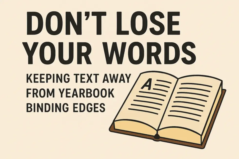
DON’T LOSE YOUR WORDS: KEEPING TEXT AWAY FROM YEARBOOK BINDING EDGES
When you’re creating a school yearbook, it’s easy to get caught up in the fun parts – choosing photos, writing captions, and laying out creative designs. But one of the most important (and often overlooked) details is where your text sits on the page.
Specifically, you need to make sure text doesn’t sit too close to the binding edge, or you risk having your words swallowed up by the spine once the book is printed and bound.
WHY BINDING EDGES MATTER
-
A yearbook is typically bound using either perfect binding (like a softcover book) or case binding (like a hardcover). In both cases, the inner edges of the pages curve slightly into the spine. Anything placed too close to this “gutter” area becomes difficult to read, or worse – partially hidden.
What looks perfectly fine on your computer screen may not translate once it’s physically printed and bound. If headings, captions, or student names slip into that danger zone, they can appear cramped or cut off, which can spoil an otherwise polished page.
LEFT PAGES vs RIGHT PAGES
Every spread in a yearbook has a left-hand page and a right-hand page, and it’s important to remember that the binding edge alternates.
-
On a left page, the binding edge is on the right side of the page.
-
On a right page, the binding edge is on the left side of the page.
This means you can’t simply set your margins the same way across the board. What’s safe on one side of the spread might disappear on the other.
HOW MUCH SPACE SHOULD YOU LEAVE?
-
A good rule of thumb is to leave at least 10-15 mm of “safe space” inside the binding edge. This ensures that all text remains visible and comfortable to read once the book is bound. It also gives the design some breathing room, making pages look clean and professional.
THE BIG PICTURE: READABILITY AND PROFESSIONALISM
-
A yearbook is more than just a collection of photos – it’s a keepsake that families and students will treasure for years. If text is squashed into the gutter, it can make important memories difficult to enjoy. Clean margins show attention to detail, improve readability, and help the yearbook look like it’s been designed with care.
FINAL TIP
-
When designing your yearbook, always preview your spreads with binding in mind. Check both left and right pages, use consistent gutter margins, and keep text comfortably clear of the spine. A little extra space goes a long way in ensuring your words – and the memories they capture – are never lost in the fold.